The Raphael theme (BETA)

Status
Not open for further replies.

omktg

Active Member
Hey guys, @Yaros @Ekaterina Sayapina

Here is a comparison between the Raphael theme and 2 Shopify themes that have the highest conversion rate.

From left to right: Raphael - Shoptimized - Booster

Shoptimized is the Shopify theme with the highest CR, because of its design elements that increase conversions. Booster is another Shopify theme with high CR.

Is there prove that those are the ones with the highest CR?

Yes it is:

Screenshot_181.png

Who is Mohamed Ali Aguel?
Well he runs several 7 figure e-commerce stores... and makes 2 million USD a month on average

Screenshot_182.png

Tristan Broughton, he runs several successful dropshipping stores.

Desktop View: Noticed that the Raphael product image looks weird? like double... Well, this is because on desktop the displayed image has an strange displacement at the bottom while scrolling. Like a wrong applied parallax effect, that should be fixed.

raphael-comparison-desktop.jpg

Mobile View: Take a look at the design elements. Why have you placed the TITLE, PRICE and REVIEWS before the image? Have you guys tested this? Is there a theme that has proved that it works?

If you want to add conversion boosting features to your themes, then you should look at what is working here:

https://shoptimized.net/theme/#features

From left to right: Raphael - Shoptimized - Booster

raphael-comparison.jpg
 

omktg

Active Member
Hey guys @Yaros @Ekaterina Sayapina

Found some other issues...

There is an overlapping of characters in the currency display. It could be better to just show USD and so on for the other currencies [FLAG name]

Screenshot_177.png

This is just a suggestion... The magnifying glass icon inside the search box, has no purpose at all, because we have the word SEARCH at the left side, and also because the icon disappears once with click inside the box.

Screenshot_178.png

There is no way to know if a category has subcategories unless you hover over them. Take a look on how Shoptimized and booster handle this:
https://forum.alidropship.com/threads/the-raphael-theme-beta.6837/post-39898

Screenshot_179.png

Why have to placed the Title, Price and REVIEWS before the image? Have you guys tested this, or is there proof that it converts better?
If not it could be a problem, and a conversion killer.

Take a look on how Shoptimized and booster handle this:
https://forum.alidropship.com/threads/the-raphael-theme-beta.6837/post-39898

Screenshot_180.png
 
E

Ekaterina Sayapina

Guest
Hey guys @Yaros @Ekaterina Sayapina

Found some other issues...

There is an overlapping of characters in the currency display. It could be better to just show USD and so on for the other currencies [FLAG name]

View attachment 5014

This is just a suggestion... The magnifying glass icon inside the search box, has no purpose at all, because we have the word SEARCH at the left side, and also because the icon disappears once with click inside the box.

View attachment 5015

There is no way to know if a category has subcategories unless you hover over them. Take a look on how Shoptimized and booster handle this:
https://forum.alidropship.com/threads/the-raphael-theme-beta.6837/post-39898

View attachment 5016

Why have to placed the Title, Price and REVIEWS before the image? Have you guys tested this, or is there proof that it converts better?
If not it could be a problem, and a conversion killer.

Take a look on how Shoptimized and booster handle this:
https://forum.alidropship.com/threads/the-raphael-theme-beta.6837/post-39898

View attachment 5017
Thank you very much for your input!
There is a great number of websites which have product title and price above product image (Crate&Barrel, Zappos, Net-A-Porter, Nike, Reebok, Adidas, Urban Outfitters, Victoria's Secret, etc.) Anyway, we'll run A/B tests a bit later to make sure we've made the right choice.
 

omktg

Active Member
Thank you very much for your input!
There is a great number of websites which have product title and price above product image (Crate&Barrel, Zappos, Net-A-Porter, Nike, Reebok, Adidas, Urban Outfitters, Victoria's Secret, etc.) Anyway, we'll run A/B tests a bit later to make sure we've made the right choice.

Thank you Ekaterina, that is a relief.
 

omktg

Active Member
@Ekaterina Sayapina

Can you please make this [credit card images below the add to cart] customizable:

Screenshot_185.png

Because those images depend on the payment services we choose. They may vary according to the service. and in some cases there are people who choose not to use PayPal, etc.

And it would be great, if you could add the same functionality to all the built in themes [the ability to add a custom image below the add to cart button] Seriously it would be great.
 

Raphyjoe

New Member
We’re very excited to let you know that our brand new theme Raphael is ready for beta testing.
We’ve done the most thorough UX research to deliver the perfect product to you: amazing clean design which keeps the focus on your products and meets all usability requirements increasing your brand loyalty. The theme is ideally suited for stores with both large inventories and small catalogs.


Please make sure you have the latest version of AliDropship original plugin before giving Raphael a try. The theme is not compatible with AliDropship Woo plugin.

Check Raphael demo website.
Knowledge Base guide.

Here are some key features to discover:

Homepage
Products in category menu. Showcase most popular items in your menu.

4d2b66800ba3.png
157b342b2a73.png

Zoom & glow hover effect. Eye-catching hover effect on product images (Homepage, Category page, Cross-sell section)
e05f128d3bb6.png

Homepage video. Feature a YouTube video to tell more about your store.
09e809448828.png

Category images on Homepage. Add pictures to category boxes to enhance customer visual experience.
4441831e6a53.png

Full-width Instagram feed. Share your latest Instagram posts in a full-width feed.
bb97426771f0.png

Homepage testimonials. Add credibility to your store by sharing customer reviews on your Homepage.
6ff7271ff0cf.png

Bigger subscription box. Take another big step towards customer engagement.
2d2bd9f67ae8.png

Blog articles on Homepage. Connect with your clients and extend their shopping experience.
b4ab1fe83bf2.png

Single product page
Payment icons under the Add to cart button. Show your customers a variety of payment methods available on your website.

6227ff806f71.png

Why Buy From Us tab. Tell your customers about advantages of shopping with you.
346d86ab8f2e.png

Cross-sell products. Encourage your clients to continue shopping by displaying related items.
d666a395ede7.png

Sticky Add to Cart button. Make the main website call-to-action button even more persuasive on mobile phones.
1e4a91e2787f.jpg

View all variations link. Product variations are placed in one line slider on mobile phones. Use the View all link to show all available variations.
0252285c37a3.jpg


Blog
New blog design.
19d971f96e1b.png

Side shopping cart.
f4fa7919a036.png

Multi-step checkout.
c52d113b6dcc.png

We’re looking forward to your feedback! Don't hesitate to reach out if you have any questions or improvement ideas.

P.S. Please keep in mind that this is a beta version of the theme, Search dropdown is still under development, we'll add this feature shortly.
@Ekaterina Sayapina, Raphael is looking great and awesome, i have seen the contributions of other members and i feel i should add this.. "CURRENCY CONVERTER" would definitely be a good feature to have, it makes it easy and convenient for customers to buy from their own currencies.
 

omktg

Active Member
Hi @Ekaterina Sayapina ,

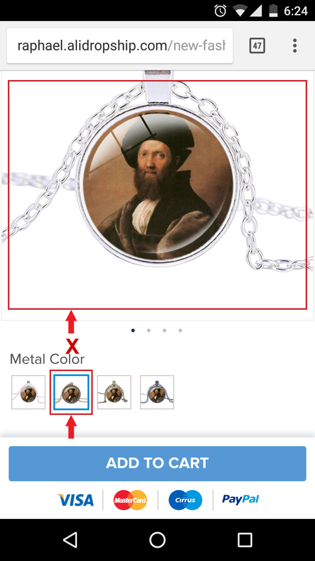
When you select a product variation on mobile [product page], the main image doesn't change... It does not show the variation you are selecting like in all the other themes. But it works normal on desktop:

Screenshot_20180801-182413.png


I also noticed that the movement effect of the main product image [the one i talked about here] is creating some issues on some screen sizes:


The video shows a test on a screen size of 1366*768 [720p]
As you can see, on that screen size it is not possible to see the image thumbnails below the main image, because of that movement effect.

Maybe that effect is to hide the thumbnails while scrolling... but right now is creating some issues. You can fix it to work on all screen sizes, or just delete it. If this continues you could see less, or no conversions on those screen sizes.

If a user detects an error in the page, he could then doubt the credibility and security of it. We should avoid that.

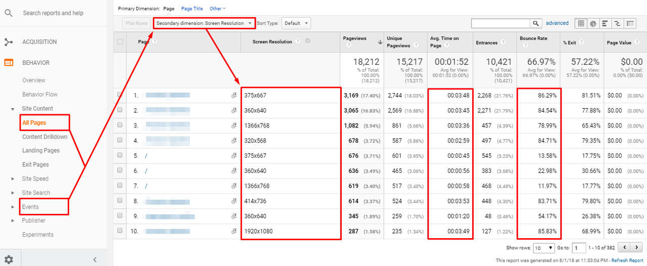
If you are running some tests already, just take a look at your Google Analytics account, and drill down to screen resolution/size to see if a particular screen size is performing worst than others [you can do this while looking at all your pages, events, etc]

Screenshot_193.png


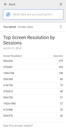
You can also check top performing screen sizes just by typing using analytics intelligence:

Screenshot_192.png


The Idea here is to identify problems and fix them.
 
Last edited:

omktg

Active Member
I also enabled the reCAPTCHA Settings under the Accounts tab, but it is not working on my contact form page.
The other themes shows a recaptcha box that says: I'm not a robot

But Raphael is not showing anything.
 
E

Ekaterina Sayapina

Guest
Hi @Ekaterina Sayapina ,

When you select a product variation on mobile [product page], the main image doesn't change... It does not show the variation you are selecting like in all the other themes. But it works normal on desktop:

Screenshot_20180801-182413.png


I also noticed that the movement effect of the main product image [the one i talked about here] is creating some issues on some screen sizes:


The video shows a test on a screen size of 1366*768 [720p]
As you can see, on that screen size it is not possible to see the image thumbnails below the main image, because of that movement effect.

Maybe that effect is to hide the thumbnails while scrolling... but right now is creating some issues. You can fix it to work on all screen sizes, or just delete it. If this continues you could see less, or no conversions on those screen sizes.

If a user detects an error in the page, he could then doubt the credibility and security of it. We should avoid that.

If you are running some tests already, just take a look at your Google Analytics account, and drill down to screen resolution/size to see if a particular screen size is performing worst than others [you can do this while looking at all your pages, events, etc]

Screenshot_193.png


You can also check top performing screen sizes just by typing using analytics intelligence:

Screenshot_192.png


The Idea here is to identify problems and fix them.
1. The variation image bug has already been fixed.
2. Video. Sorry, I'm not really sure what exactly you find confusing. Image gallery is supposed to be hidden when you scroll down so that you can still see the big product picture. Besides, I've tried to reproduce the faulty image issue (you say that it doubles) on a screen size 1366*768, it looks just fine when I scroll down.
3. Thanks for the stats ideas.
 

omktg

Active Member
1. The variation image bug has already been fixed.
2. Video. Sorry, I'm not really sure what exactly you find confusing. Image gallery is supposed to be hidden when you scroll down so that you can still see the big product picture. Besides, I've tried to reproduce the faulty image issue (you say that it doubles) on a screen size 1366*768, it looks just fine when I scroll down.
3. Thanks for the stats ideas.

1. Great
2. I did not explain it correctly.
I know that the idea here is to hide the thumbnails while scrolling down. The first time i talked about that effect was because i saw it in a product page with no thumbnails, so it was weird to see that sliding effect with no purpose... but now i get the idea.

Now i am not talking about the same thing, i am talking about the thumbnails been hidden before the user can see them [the first part of the video]:

Screenshot_194.png

Now the problem is that in this particular screen size, the user will never be able to see the thumbnail images below the main one, because they will hide before the page is scrolled down.

This could be because the effect is set to start when the main image hits the top of the page. So in that case, the main image is almost as big as the page height and it hits the top before the page is completely scrolled down, hiding the thumbnails before the user is able to view them.

3. You're welcome

4. Don't forget to check the reChaptcha...
https://forum.alidropship.com/threads/the-raphael-theme-beta.6837/post-40203
 
E

Ekaterina Sayapina

Guest
1. Great
2. I did not explain it correctly.
I know that the idea here is to hide the thumbnails while scrolling down. The first time i talked about that effect was because i saw it in a product page with no thumbnails, so it was weird to see that sliding effect with no purpose... but now i get the idea.

Now i am not talking about the same thing, i am talking about the thumbnails been hidden before the user can see them [the first part of the video]:

View attachment 5073

Now the problem is that in this particular screen size, the user will never be able to see the thumbnail images below the main one, because they will hide before the page is scrolled down.

This could be because the effect is set to start when the main image hits the top of the page. So in that case, the main image is almost as big as the page height and it hits the top before the page is completely scrolled down, hiding the thumbnails before the user is able to view them.

3. You're welcome

4. Don't forget to check the reChaptcha...
https://forum.alidropship.com/threads/the-raphael-theme-beta.6837/post-40203
Thank you for explaining this to me! You definitely have a point.
 

omktg

Active Member
Hello Guys, @Ekaterina Sayapina , @Yaros

I noticed that you updated the theme: http://raphael.alidropship.com/
That's great... Could you please tell us when it will be available for download/update?

Checking the new version, i noticed something that should not be there by default, and i am talking about the delivery truck at the left of the shipping text in the header:

Screenshot_199.png

The reason why it shouldn't be there by default, is because right now we can do it ourselves just by adding any icon or emoji if we want in the text field inside the theme customization tab:

Screenshot_200.png

So there is no need to limit us to just one truck icon, if right now we can put any icon, emoji or text there if we want. Maybe you want to add a fire emoji to tell your customers about a hot offer.

Right now, without that default truck, we can add anything we want, just by adding it to the text field. So please don't limit our possibilities:

Screenshot_201.png
 

omktg

Active Member
Hi @Ekaterina Sayapina ,

Could you please tell me when is this theme will be ready for download / update? I'm testing it on a new website and there are some things that I'm not sure if they were already fixed in the latest version.
 

omktg

Active Member
We are going to release it next week.

Awesome News Yaros,
I already bought 2 additional Alidropship plugins, and I'm finishing configuring the first site using this theme, so for the next week I will have the 2 sites configured and ready for the updated version.

One thing that happened to this site i'm working on, is that when i created the categories, they did not appear in the menu section, so i had to add them to the menu as custom links:

Here you can see i created several categories, and i add 3 products to one of them.

Screenshot_204.png

But when i tried to create a menu for those categories, they were not at the categories tab, so i had to add them as custom links.

Screenshot_205.png

And another thing that I am sure of whether it is normal or not, is that when I added the 3 products to one of the categories. On the home page, the TOP SELLING PRODUCTS area was populated, but nothing happened in the area of BEST DEALS or NEW ARRIVALS... is this normal? Should I complete more categories so that these sections become auto populated?

Screenshot_206.png
 

Yaros

Moderator
Staff member
Awesome News Yaros,
I already bought 2 additional Alidropship plugins, and I'm finishing configuring the first site using this theme, so for the next week I will have the 2 sites configured and ready for the updated version.

One thing that happened to this site i'm working on, is that when i created the categories, they did not appear in the menu section, so i had to add them to the menu as custom links:

Here you can see i created several categories, and i add 3 products to one of them.

View attachment 5167

But when i tried to create a menu for those categories, they were not at the categories tab, so i had to add them as custom links.

View attachment 5168

And another thing that I am sure of whether it is normal or not, is that when I added the 3 products to one of the categories. On the home page, the TOP SELLING PRODUCTS area was populated, but nothing happened in the area of BEST DEALS or NEW ARRIVALS... is this normal? Should I complete more categories so that these sections become auto populated?

View attachment 5169
Yes you should complete more categories by adding some more products. It is done specially to avoid duplicated items on your home page.
 

ahmedsizan

New Member
Thanks for the update on theme release. Please let us know the on releasing it.

I have three suggestions for the theme.

1. The picture preview on main menu when I hover the mouse pointer on desktop has one issue when the product has ',' on its name. For instance, if I name the product women's sleek shoes, it would display it as women’s sleek shoe
2. Can you please give us the option to not have Top categories on the mobile page as users seems to think this are the only categories. It does say top categories in the mobile version.
3. Can you please add some icons to the widget where information such as 2000+ deliveries is. The icons in DaVinci were great.

Also
 

ahmedsizan

New Member
One other thing I would like to add is the gallery picture doesnt seem to change when a variation is selected on a mobile device. It wourks well in the desktop.
 
Status
Not open for further replies.
Top