
omktg
Active Member
1. We'll fix this straightaway! Thanks for letting us know.
2. If font size looks small to you, please feel free to increase it in the .desc-header .text-shipping div class (FREE WORLDWIDE SHIPPING) and #shipping-collapse p, #shipping p, #specifics p, #why_buy-collapse p, #why_buy p (single product description). Anyway, we appreciate your feedback!
3. Not sure how to reproduce the Add to cart bug. Could you please explain one more time?
Hi @Ekaterina Sayapina ,
1. About the Font Size...
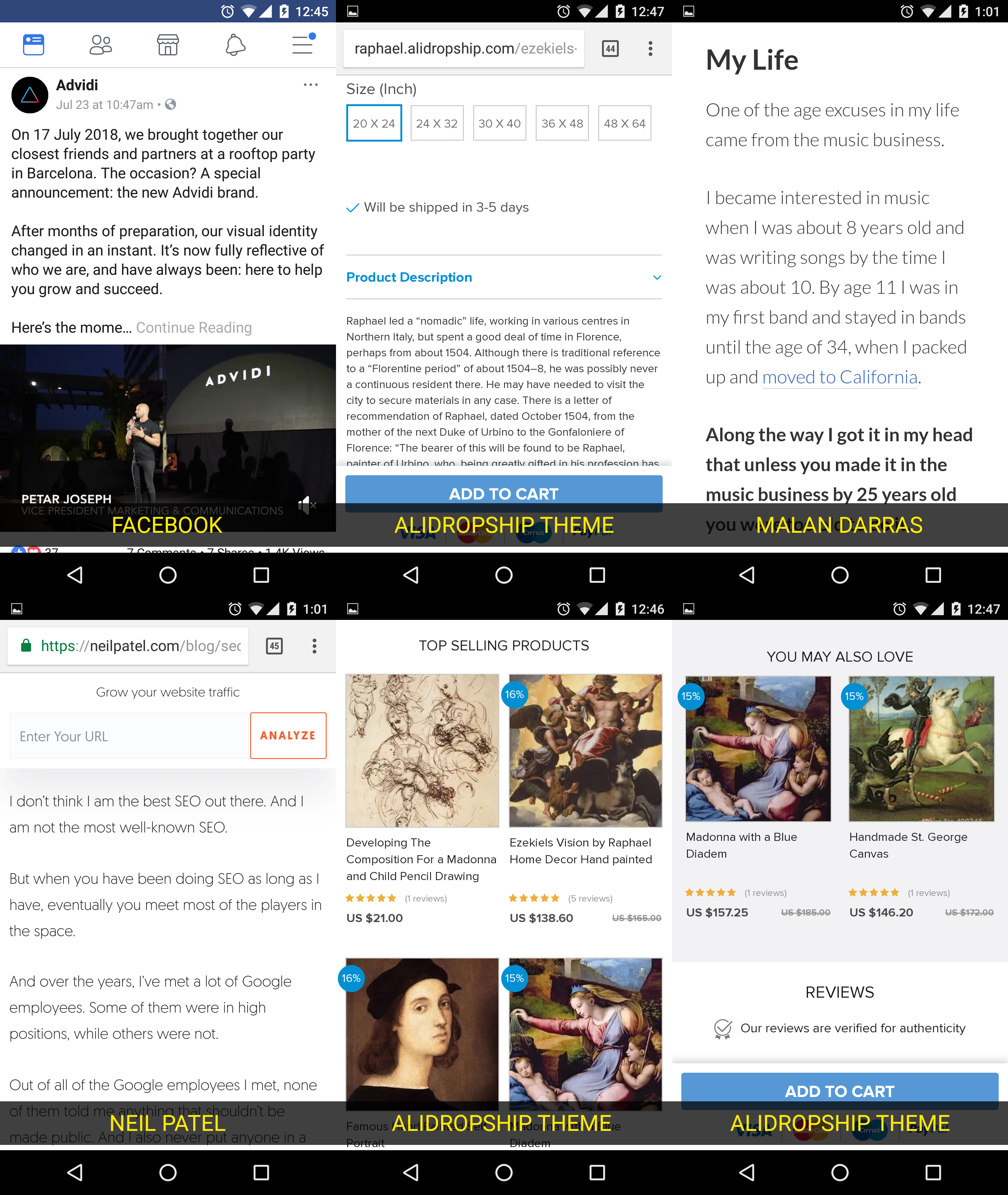
The fonts look small, but not just to me. I think i said this before:
People older than 35 will convert better on pages with bigger text.
I've been doing this for many years as an affiliate. But dont take my word... take a look at this post form Malan Darras:
7) Font Size
This is a point of optimization that gets overlooked a lot.
Don’t overlook it.
It’s definitely not the first thing I test, but after I have the headline, image and body copy worked out it’s something I like to try.
Most websites have an average font size of about 12 px. So I set up a test with several different font size, some bigger some smaller to see what happens.
A test might look something like:
Landing Page 1: Font size = 12px
Landing Page 2: Font size = 10px
Landing Page 3: Font size = 14px
Landing Page 4: Font size = 16px
What I’ve found is that if your readers are over the age of 35, increasing the font size almost always makes the page work better.
As you get older, your vision gets worse. By increasing the font size, you’ll ensure that your readers can actually SEE the text on the page.
Source: https://www.malandarras.com/10-ways-to-optimize-a-landing-page
It also depends on the font style you are using, but in general:
The font size should be easy to read on all devices without having to zoom in to read.
And if you noticed, you can't zoom in a product description, on this theme, or for example in Michelangelo while on a mobile phone.
2. About the ADD TO CART...
Theme is not showing the ADD TO CART button on certain screen sizes. I checked this on my Ipad PRO 12.9" [chrome and safari browsers]
Here is a screenshot using chrome [Ipad horizontal view]

Here is a screenshot using chrome [Ipad vertical view] THERE IS NO ADD TO CART

Here is a screenshot using safari [Ipad horizontal view]

Here is a screenshot using safari [Ipad vertical view] THERE IS NO ADD TO CART

And finally, i also tested it on my laptop chrome browser. With the inspection tool you can replicate the same error by changing screen sizes/devices:

3. About some mobile issues...
Today i found some other issues on mobile:
The home button, is not clickable

On the Contact page, shouldn't the text be before the contact form?

Well, i think that all i have. I hope it helps.

")